Fidelity & eMoney
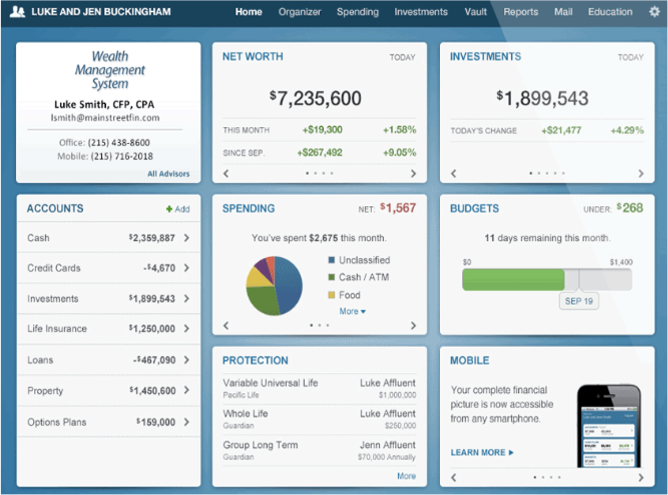
Fidelity Investments acquired eMoney to tap into B2C investment markets on mobile platforms. The card format of the site didn’t feel like it had a strong presence or main statement to make. No one card drew your eye in or focused your attention. This created visual noise or confusion for the customer trying to make sense of their investment strategy.
Customer Pain Points
-
"Just tell me if I'm on track to reach my goals."
-Investor client
-
"I need an easy way to customize this to my brokerage."
-Financial Advisor
-
“How do we get this closer to the current Fidelity account format so I don’t need to learn new systems?”
-Fidelity Institutional
Project:
Simplify and define a core set of values to guide the investor customer in their journey.
-
Since eMoney was an acquisition product, Fidelity Institutional stakeholders wanted to keep the eMoney branding but get it more in line with the way Fidelity has their account UI organized.
-
Investors liked having a dashboard that was mobile friendly, but with a lack of customization they didn’t know what part of the dashboard to focus on. Static cards were eventually ignored, similar to banner blindness in webpages and ads. Financial Advisors using this system felt it was too time consuming to customize and add their own branding, instead relying on default reporting that was overwhelming for clients to wade through.
-
Designer and writer work on mock ups > Send for review with stakeholders (rinse, repeat).
Pull strings and assets into file types.
Site review & QA done by design.
Release to the public.
-
Layout has a more coherent narrative focusing on the investor’s goals and not some arbitrary display of data. More consistency between the left hand menu UI found in Fidelity accounts if a customer has both a Fidelity and an eMoney account. Item description

Most investors fall into two categories, retirement or “something else”
It could be a car, a house, the world is your oyster. This simple choice starts the process for all new accounts to follow a goal-oriented format for investors.

Redesigned with your goals in mind.
Instead of a scatter shot approach to metrics and data, this layout focuses on the investor’s goals, account info (similar to Fidelity’s core UI structure with left hand account menus), and important notifications at the top.

More choices and customization available to advisors.
Financial advisors could view and customize any data set by applying filters or visualizations such as pie, bar, line charts, etc.